

Why I Love Flexbox
When creating layouts in Flexbox the sky is the limit and I want to show you how you can start. When building the majority of my websites, I always reach for Flexbox. There are a few reasons for this:
- Easy to get started with
- No need for installing packages
- Can be as complex or simple as you define
- Works great with centering elements
- Set up well for building responsive designs
This tutorial assumes basic knowledge of Flexbox that will not be covered. If you are completely new to Flexbox I would recommend:
This guide will teach you everything from the ground up. It covers all the basics as well as advanced properties. I use this all the time when referencing properties I don't use often.
Let's get started!
Making Responsive Elements
In this tutorial, we will use 4 blocks and show them collapsing as we change our breakpoints. These blocks can be any element inside a container div.
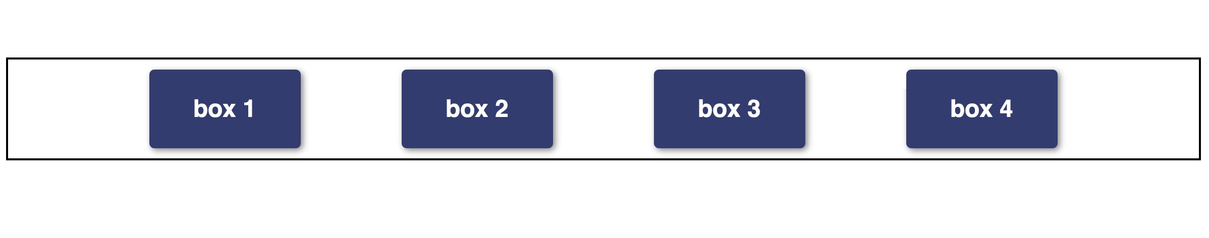
When I approach creating a Flexbox layout I focus on creating the containers first. In the image above the black border is on the container div. This div is what we will make our flex container. Here is the code for the container minus the colors and margins.
.container {
  display: flex;
  justify-content: center;
}
If we were to shrink the page width at this point the elements would not collapse. The trick in making this work is using the awesome flex-wrap: wrap property. What this does is wrap every element directly inside the flex container. As your page width shrinks the elements start stacking.
.container {
  display: flex;
  justify-content: center;
  flex-wrap: wrap;
}
This allows you to write responsive CSS with no need for media queries.
Here is the full Codepen so you can play with it yourself and see how it works.
Tips
The main issue you will run into is how you set up your container. This was a pain point for me when applying these techniques to real layouts. In the previous paragraph, I say that flex-wrap will wrap every element within that div. This is an important thing to pay attention to. This means you want to set up your HTML like this.
<div class="container">
  <div class="box">
    <h2>box 1</h2>
  </div>
  <div class="box">
    <h2>box 2</h2>
  </div>
  <div class="box">
    <h2>box 3</h2>
  </div>
  <div class="box">
    <h2>box 4</h2>
  </div>
</div>
When applying this to real layouts make sure you pay attention to what container your flex-wrap property is on and which elements become its direct children.
Lastly, add borders to these containers to make sure you are doing it correctly which will help debug any issues.
Conclusion
I hope you learned something from this tutorial. This is a basic property in Flexbox and there is lots more to dive into. I hope this gives you a taste of the powerful things you can do in Flexbox while writing very little code.